A screenshot of The Gold Sheet taken from a Chicago Sun Times article.
Here’s a memory that goes back to the 1980s when I worked in the downtown OKC newsroom of The Daily Oklahoman.
Every Thursday afternoon during football season, I would walk about three blocks down to Taylor’s Newsstand from the paper’s Broadway & 6th Street headquarters.
You might remember Taylor’s Newsstand. It was located in the Century Center mall attached to the Sheraton Hotel. Taylor’s offered an awesome variety of magazines and newspapers from around the country. I fact, I bought a lot of Sunday papers from Denver, Kansas City and Dallas at Taylor’s over the years.
But that’s not what drew me to the newsstand on Thursdays in the fall. It was a publication that Taylor’s sold called The Gold Sheet.
Man, I loved to get my hands on The Gold Sheet each week.
If you are unfamiliar with it, The Gold Sheet was a football handicapping publication. A tout sheet. Still is, in digital form.
It was printed on heavy gold paper that unfolded into a large single sheet that contained predictions and analysis on every Division 1 and NFL football game for the coming weekend.
I’m pretty sure that my friend ‘David’ introduced me to The Gold Sheet, and I became a loyal reader.
I wasn’t much of a gambler, but coworkers at the newspaper in that mid-1980s era connected me to a bookie here in town who would would take my tiny wagers of $10 or $20.
So, The Gold Sheet became a big part of my weekly rhythm throughout the 1980s, when I was still single and willing to wager a few dollars on football.
Yes, I know it’s shocking that gambling on football (and other sports) occurred in OKC. But it did in the ’80s, and I’m certain you wouldn’t have to work too hard to find a bookie today who would take your wagering action.
A Bold Prediction: Oklahoma will have legal, online sports wagering within the next 5 years.
As for The Gold Sheet itself, it contained a prediction on the outcome of every game along with a couple of sentences that backed up each pick. It made for great reading, if nothing else.
Maybe because today is Super Bowl Sunday– by far the No. 1 day annually for sports wagering (sorry Final Four, Kentucky Derby et al) — I stumbled across a reference online this morning to The Gold Sheet.
And that got me to wondering what became of my favorite handicapping publication.
So, I did a little online research and discovered a Chicago Sun Times article from 2022 that revealed that it is now part of an online handicapping website called WagerTalk Media.
The article also outlined the history of The Gold Sheet, which was launched in Los Angeles by the late Mort Olshan in 1956. It remained a physical publication until the end of the 2019 football season, when it morphed into a digital publication.
A wave of nostalgia washed over me when I discovered the Chicago Sun Times article, which included a picture of The Gold Sheet from back in the day.
My weekly wagering days are long gone. But The Gold Sheet remains a fond memory of that time in my life.
BONUS CONTENT: Steve Lackmeyer, my friend and former colleague at The Oklahoman, wrote about the demise of Taylor’s Newsstand when it finally closed for good in 2009. Turns out The Gold Sheet outlasted the newsstand where I first discovered the publication.
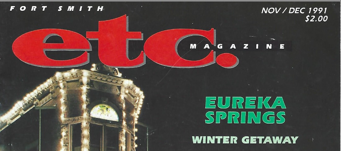
Almost 34 years ago, a friend and former coworker at the Southwest Times Record in Fort Smith, Ark., hit me up with a request.
Patti had left the paper to become editor of a new local magazine called Fort Smith Etc. She asked me to write an article on the University of Arkansas’ stunning move from the now late Southwest Conference to the the rival Southeast Conference.
Arkansas announced in August 1990 that it was switching conferences, and actually made the move the following year.
The unexpected conference divorce set off shockwaves among major conferences and ushered in what has become an era of constant realignment. By 1995, the SWC was no more, with most members welcomed into the Big Eight, now known as the Big 12.
Anyway, I wrote a pretty snarky — for me — 800-word piece for the magazine that listed all the things the Razorbacks would not miss from the SWC. It was published in the Nov./Dec. 1991 edition of Fort Smith Etc. magazine.
So, why am I writing about this now when I hadn’t given the article a thought for the last 30 years or so?
Turns out a high school friend of mine and Fort Smith native I’ll call ‘Will’ discovered he had digitized copy of the article on his personal computer. Will, who also had written for the magazine, emailed it to me. Thanks, Will!
After reading what I wrote more than three decades ago, I’m still proud of how it turned out and the fact that it is still relevant today in this era of conference reshuffling.
There are a couple of references to now departed venues like Barnhill and Reunion arenas (and misplaced campus locations for the universities of Alabama and Mississippi), but it’s not too dated, I think.
With all that said, I’m reprinting the article here in BlogOKC. Hope you enjoy this trip down memory lane.
Signed, sealed & delivered to the SEC
Mac Davis, the curly-haired crooner with the West Texas drawl, probably said it best for University of Arkansas fans when he sang something like “Happiness is the state of Texas in my rear view mirror.”
That was the theme when 10,000 or so Hog-callers began their final caravan across the Red River and out of the Lone State after the Southwest Conference basketball tournament last March. The Razorbacks had bid adieu to their SWC step-brothers with an astounding thrashing of the Texas Longhorns for the tournament championship, and along with the Razorback women’s team, hauled away every basketball prize the league had to offer.
When it was over, they called the Hogs in Dallas one final time, took the “Barnhill South” sign down from in front of Reunion Arena and began the pilgrimage back to the Ozarks. The last one out should have stopped and burned the bridge that spanned the Red River.
Without a glance in the rear view mirror, Razorback basketball fans got out the map and charted Knoxville and Birmingham and Jackson and all the Southeast Conference stops in between. The SEC, a conference that already featured teams in seven states, threw open the doors to Arkansas with a great big “Welcome.”
In Texas, the resentment of any Arkansas’ SWC success ran deep in such holes-in-the-prairie as Waco and Lubbock. The Razorbacks own a legacy of SWC success that can’t be exorcised from the conference record book. You can look it up.
Nevertheless, despite 76 years of SWC membership (Arkansas was a charter member), Arkansas forever remained an outsider who annually crashed a party that should have been a Texas-only affair.
Well, it is now. The SWC is reduced to eight Texas schools, any six of whom would be welcomed this very minute into the Trans-America Conference or the American South.
If there were any tears, they were those shed by Dallas merchants, who may have been the only people inTexas who realized from where the success of the SWC basketball tournament came.
Arkansas now has been signed, sealed and delivered to the Southeast Conference and there should be no nostalgic or sympathetic thoughts for the conference left behind in Texas.
Unsure? I offer ten reasons never to never look back at the SWC:
1. Average attendance at SouthwestConference basketball games in 1990-91 was 3,963. The SEC averaged 11,585.
2. Mississippi, with an average of 3,949, was the Southeast Conference’s poorest draw in basketball in 1990-’91. Texas Tech (2,465), TCU (3,868), SMU (2,938), Rice (2,873) and Houston (3,387) all had lower attendance averages.
3. Average attendance at Southwest Conference football games in 1990 was 39,382. The SEC averaged 63,870.
4. Southwest Conference teams were forced to play a limited football schedule for two seasons because one conference member, SMU, was given the “death penalty” by the NCAA; no SEC school has ever drawn the “death penalty.”
5. The Cotton Bowl is played in an open-air stadium, often in some of the most brutal weather Texas has to offer on New Year’s Day; the Sugar Bowl, played in the New Orleans SuperDome, is never threatened by the weather.
6. Southeast Conference football games are broadcast nationally over the Turner Broadcasting System cable network. SWC games are broadcast throughout Texas on something known as the “Raycom Sports Network.”
7. Arkansas will never have to face Southwest Conference officials when playing a Southeastern Conference game.
8. Texas A&M, a school full of traditions, features an all-male corps of cheerleaders.
9. There is no horror movie titled “The Tennessee Chainsaw Massacre”
10. Few natives from any Southeastern Conference state answer to the name of “Tex.”
UPDATE:American Airlines responded to this post and has put us back on track to receive a refund for the canceled portion of our daughter’s flight. Customer service lives to see another day! Thank you, American Air.
Call me an entitled American, if you like, but there seems to be a wide gulf these days between the words “customer” and “service” in our society.
I’m talking about when you call the “customer service” line of a major corporation and have to work through 15 AI bots that can’t help with any of your issues before a human finally comes on the line.
And when you finally connect to a human, there’s little help and even less empathy. Try talking to the “loyalty” department at the phone company known as the Death Star.
But I’m not here to rage on AT&T today. I’ll save that for another time.
Today, I’m ranting about a recent experience with the customer service department at American Airlines. Here’s the story:
My daughter, who lives in Florida, flew home for a few days the second week of January. She was to fly out of OKC Will Rogers International Airport at 4 p.m. Saturday on the return trip.
We were planning on taking her to the airport mid-afternoon until … she got a text about noon that her flight to DFW had been canceled. Canceled!
And Sarah had a connecting flight that evening to Fort Lauderdale with a 7 p.m. departure.
My wife and I were about to jump in the car and drive her to Terminal C at DFW when Sarah received yet another text from the airline. She had been rebooked for a Sunday flight — with no input from her.
Things got tense at our house as Sarah told us how important it was to her to get back to Florida on Saturday night. She still had what I assumed to be a valid boarding pass for the 7 p.m. flight.
So, I got on the phone, called the American Airlines customer service line and actually got a human on the line with not much delay. When I told him about our dilemma, he took the flight information from me and said, “oh, she’s been rebooked for tomorrow.”
Yes, I know, but we are driving her down to DFW this afternoon to make the 7 p.m. flight to Fort Lauderdale.
“She won’t be able board that flight because she’s now booked for tomorrow. And the 7 p.m. Fort Lauderdale flight is completely full. anyway.”
We went back and forth for a few minutes, but he was clear that her boarding pass was no longer valid.
So, I hung up and walked back into our living room where I found my daughter talking to another American Airlines customer service person who was far more accommodating. This person told her that she could still use her Fort Lauderdale boarding pass for the 7 p.m. flight, although she might not have the same seat assignment.
Two customer service folks from the same airline with two different outcomes. A rain-on-our-parade from one and a ray of hope from the other.
So, I can’t call out everyone in their customer service department. Sometimes there are unexpected pleasant surprises.
We all piled into the car and headed south, made it to DFW and dropped her off at Terminal C at 5:15. Sarah’s boarding pass DID get her on the plane and she made the 7 p.m. flight without issue.
But then… I got to thinking. Hey, American, how about a little something for the effort? Like a refund for the canceled OKC-DFW portion of the flight.
We were out gas money and time to make the drive to Dallas and back.
The next day, I got back on the American Airlines website, clicked on the “refund” button and filled in our flight numbers. The website told me that we had no canceled flights for which we deserved a refund.
What? I’m assuming the airline decided that we had a boarding pass for the Sunday flight that we didn’t use. So we were owed nothing.
I immediately found the page where you can file a complaint and wrote out this entire scenario in the space provided.
The next day I receive an email with this message:
“Please accept my sincere apologies for the experience you’ve described. We’re committed to prioritizing our customers in everything we do, and your feedback highlights this commitment. Your valuable insights will be made available to our leadership team to explore necessary improvements and deliver the world-class customer experience you expect from us.
“I appreciate your willingness to share your feedback with us. From everyone at American Airlines, thank you for choosing to fly with us. We look forward to the opportunity to welcome you on board again soon.”
Arrgh! The email addressed nothing that I wrote in the complaint form.
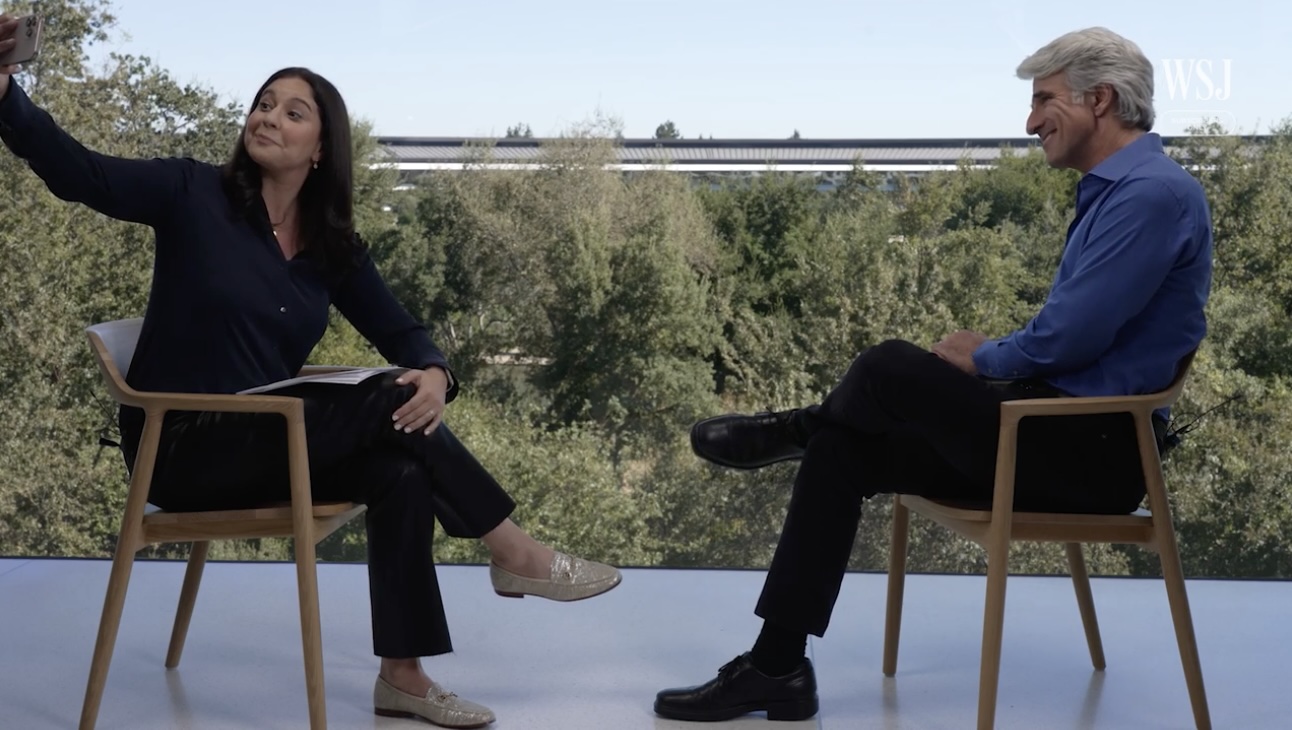
The Wall Street Journal’s Joanna Stern takes a selfie with Apple software chief Craig Federighi
If you’ve ever been fooled by a photo that had something added — or eliminated — you should watch this fascinating video interview by Wall Street Journal tech reporter Joanna Stern with Apple Inc.’s software chief Craig Federighi. The interview focused on Apple Intelligence, which is Apple’s version of artificial intelligence.
Near the end of the 25-minute interview, Stern raises her iPhone and takes a selfie of herself and Federighi as they are seated across from each other at the company’s Apple Park headquarters in Cupertino, Calif.
Then it got really interesting.
Stern showed the photo to Federighi and, using Apple’s most recent photo editing software, quickly edited out a water bottle and a microphone that the photo had captured.
She edited the photo with the intention of showing how easy it is to remove unwanted objects from photos, then asked Federighi about Apple’s approach to allowing users to alter reality in their photos. Or even adding in objects or people who weren’t there.
Federighi’s thoughtful answer about Apple’s decisions on limiting AI use in its photo software intrigued me.
“There were a lot of debates internally, ‘do we want to make it easy to remove that water bottle or microphone’ because that water bottle was there when you took that photo,” he said. “The demand from people to clean up what seem like extraneous details in a photo that don’t fundamentally change the meaning of what happened has been very, very high. So we were willing to take that small step.”
However, the company ensured that if a photo was altered, it was reflected in the metadata for that photo. And Federighi said Apple drew a line on further editing to alter the reality of their photos.
“We are concerned that the great history of photography and how people view photographic content as something that you can rely on, that is indicative of reality …” Federighi said. “And our products, our phones are used a lot, and it’s important to us that we help convey accurate information, not fantasy … we make sure that if you do remove a little detail in a photo, we update the metadata on the photo so you can go back and check that this is an altered photo.”
It’s clear that Apple has given this subject a lot of thought and is working to distance itself and its software from ‘deepfakes’ that seem to be showing up everywhere. Just check your Facebook feed.
Here’s a link to an article in Info Security Magazine that lists the top 10 deepfakes from 2022.
That debate over editing photos took me back to my days as a reporter and editor at The Oklahoman in the 1980s and 1990s. It was a time certainly before digital photos and software that let you easily alter the reality of a picture.
However, I recall there was quite a debate at the paper over whether drinks in the hands of people at a party should be edited out, by cropping or by being retouched by an artist.
So, editing photos has been an issue for decades.
And that led me to contact Doug Hoke, The Oklahoman’s current photo manager who worked at the paper all through the pre-digital age of the ’80s and ’90s.
Doug Hoke from his profile image on Facebook.
Doug is one of my favorite photographers, with a long history of shooting great photos. His work was regularly featured in Sports illustrated in the pre-digital days.
I asked Doug if my memory was correct and altered photos were an issue back in the day. Here’s what he said in response to the question:
“Way back when if Gaylord (the publisher) didn’t want something in the paper, it wasn’t there,” he said. “The airbrushing of photos was originally done to help with the reproduction, as coarse screens and letter press technique left much to be desired. That evolved into the removal of items, like cocktail drinks, (or) the adding of details like clothing, lengthening hems, adding material to swimsuits, closing up v-necks, etc.
“When the digital age hit, the ease that photos could be altered called for new guidelines for photography. What is the common practice now is no pixels should be added or removed, except by cropping, and cleaning up dust spots on the chip. Toning and adjusting contrast should only be to help reproduce the image as accurately as possible.”
Doug said he supports Apple’s limits to digital editing that distorts the reality of photos.
“When Apple first announced that they would only allow small details to be removed, I applauded them,” he said. “Craig is correct that photography is based in reality, and I firmly believe that the photos should remain as untouched as possible. You may think that water bottle is in the way, but future generations will look at these details with amazement. Think of old photos you look at, you study every detail in the photo to get a better sense of history. If we remove all those details now, no one will ever see them.”
There’s a distinction between photograph and a photo illustration, Doug said. Or there once was.
“The line between photograph and illustration has been blurred and will never be the same,” he said. “Publications try to hold onto the strict guidelines of what is a photo and what is an illustration but the public probably doesn’t really care. I don’t think the general public has a strong grasp of reality anymore. Games, TikTok, IG, X, whatever they look at. If they think an image is cool they like it without giving any thought to whether it is accurate or not.
“We have had to reject several ‘photos’ that were obviously enhanced by AI, mostly portraits. Accepting photos from unknown sources will be a huge lift in the near future as AI will just continue to get better. Really glad Apple took a stand and said just because we can doesn’t mean we should.”
Did you catch what Doug said? The public is suffering from both ignorance and apathy on whether a photo has been altered.
But we should be concerned. Thank you, Apple, for taking a stand.
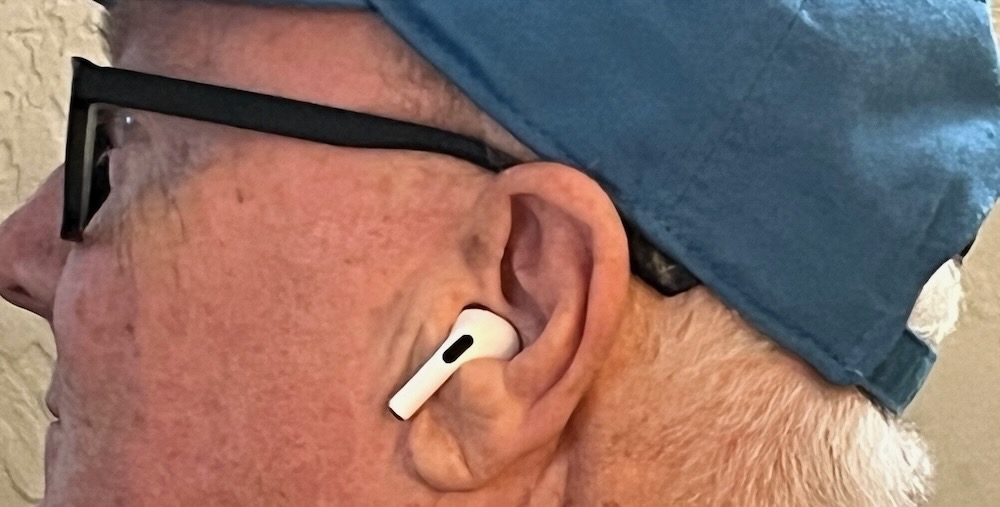
EDITOR’S NOTE: I’m updating this post to add an editor’s note and information on how the Airpods Pro 2 fit in my ears. My friend Sarah Horton asked if they hurt. I was honest and said ‘yes,’ but thought they weren’t hurting as bad as time rolled on. However, after a few more days of wearing them at least 6 hours a day, I have to admit that they squeeze against the cartilage of my ear to the point that I can’t wait to take them off. My left ear is most sore, and I’m afraid they are going to create an open wound at some point. Stay tuned.
Let me say right at the start of this that I have had a decade-long (or longer) battle with hearing loss. It’s not something that I noticed at first, but my wife and people I worked with sure did.
Along the way, I’ve been fitted with an expensive pair of hearing aids that brought their own problems. I’ll explain, but first some background.
In 2015, at age 61 and following a round of what had to be the worst case of flu I’ve ever had, I found that I couldn’t stay on my feet. Literally.
For a period of a couple months, I suffered from an unexplained loss of balance that affected my ability to drive, to walk a straight line and even stand without holding on to something.
My wife took to me see a variety of specialists, including a neurologist and a hearing specialist. I had weekly physical therapy sessions for about six weeks.
The hearing specialist conducted a hearing test that detected mild hearing loss in each ear. My wife said I had struggled with conversations for quite some time, but I assumed that was merely selective hearing loss, if you know what I mean.
The bottom line is that I came away with a pair of hearing aids at a cost that would have covered a pretty nice used car.
They helped, I admit.
But battery life wasn’t great, and the tips on the end that goes deep into your ear kept coming off in my ear. I had to go to a walk-in clinic to have a physician remove rubber tips in both ears, including one that had apparently been in the ear canal for months and took quite an effort to dig out.
Plus, I felt like the old man I didn’t want to be when I wore them.
Still, I wore them faithfully for a couple years before putting them in a drawer.
Fast forward to the end of 2024.
Apple Inc., maker of many wonderful tech devices that I have used for decades, announced that its updated Airpods Pro 2.0 had been approved by the FDA as ‘clinical grade’ hearing aids
The author wearing his new Airpods Pro 2 hearing aids
Those Airpods became my Christmas present to me. I’ve been wearing them for just over a week, and I’ve been impressed. When paired with an iPhone, you can conduct a real time hearing test on the phone, and it calibrates Airpods Pro 2 settings to accommodate your hearing loss.
The Airpods definitely provide a real hearing boost to conversations, to watching television shows and more.
Not only that, the Airpods Pro 2.0 offers several settings that amplify all sounds, provide a conversation boost, cancel out unwanted noises. And it even has an ‘adaptive’ setting that filters out noises until I speak, which facilitates conversation.
I’m not wearing them all day, every day, so I haven’t had any battery issues yet. But when I do, all I have to do is charge them in their case rather than running out to buy new batteries all the time.
I’m still playing around with different settings to see what works best for me. But, so far, I have to give the Airpods Pro 2.0 a two-thumbs up, five-star review.
Oh, there’s a big self-image boost, too, for a now 71-year old me who doesn’t want to look (or act) his age.
And the cost in 2024 dollars was less than 10 percent of what the earlier hearing aids cost in 2015 dollars.
If I was a maker of traditional hearing aids, I would be scrambling to figure out how to lower the cost of my devices, add high fidelity sound and adaptive hearing features.
Otherwise, those hearing aid producers might become the next Research In Motion, the company that manufactured the once popular Blackberry phone.
And we all know what happened to the Blackberry when Apple introduced the iPhone in 2007.
It could happen again
BONUS UPDATE (Jan. 11): I have alleviated the pain of wearing the Airpods Pro 2 by “turning” them in my ears so they don’t press up against the cartilage to hard. It makes the stems stick out a bit, but doesn’t impact how they boost hearing. I’ve worn them this way for the past two days with little-to-no pain.
EDITOR’S NOTE: In what has become an annual column of its own, I look back over BlogOKC in 2024 and list my 10 favorite posts. Not most popular, but those that meant the most to me. I went back and forth, adding some then eliminating them, because each of them meant something to me. I hope you enjoy browsing the list and clicking on the headlines to read the full post. My list of personal favorites also includes a wonderful guest post by my friend, Don Mecoy. Enjoy!
Major League Baseball Commissioner Rob Manfred said the ‘Golden At-Bat’ is being discussed
When I was a young would-be sports writer just out of college working for the Southwest Times Record newspaper in Fort Smith, Ark., my editor sent me out to cover the state small school baseball tournament.
I had not seen much high school baseball through the years, so I was caught by surprise by one particular rule the small schools played by.
It was called the “Courtesy Runner.”
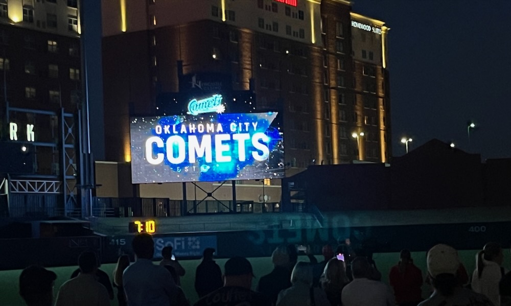
The Bricktown Ballpark scoreboard shows the team’s new name at reveal event.
The Oklahoma City Baseball Club revealed its new name, “Comets,” in a ceremony Saturday evening at the Chickasaw Bricktown Ballpark witnessed by at least a couple thousand enthusiastic fans.
I was among those who showed up for the Big Reveal, so I can attest to the collective cheer that went up when the “Comets” name and logo appeared on the scoreboard screen.
I was not expecting “Comets,” although I’m not sure what I expected. Maybe “Flycatchers,” which my friend Ed Godfrey had predicted as the future team name. Or the “Waving Wheats” or something that related to Oklahoma.
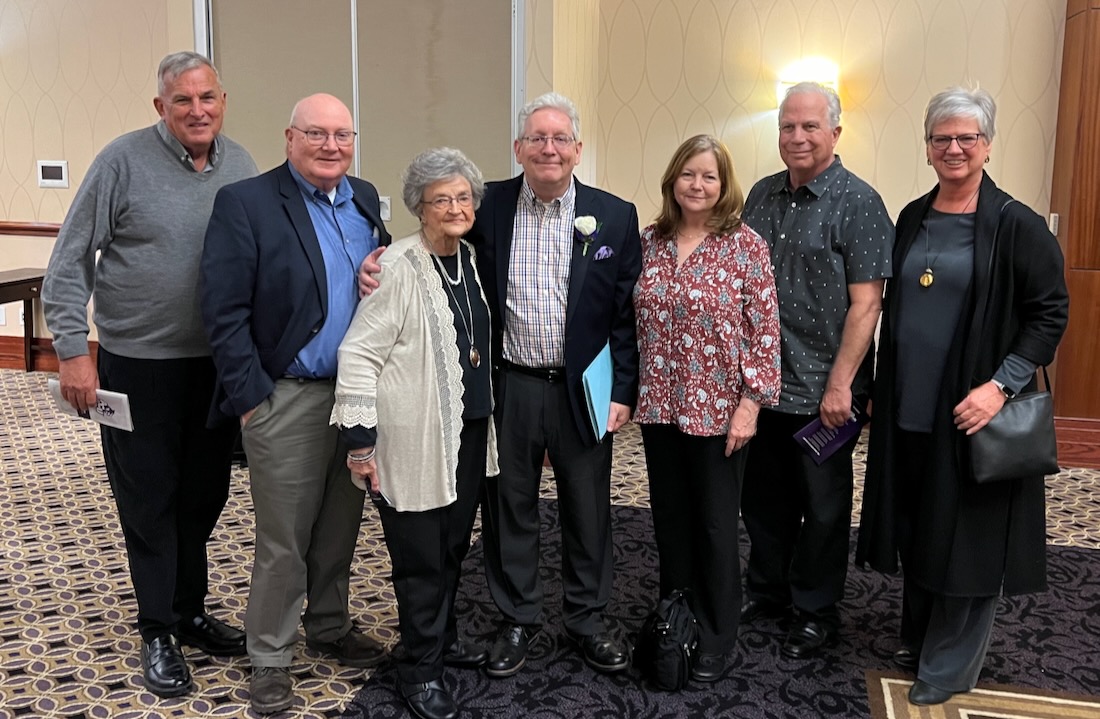
From left, Scott Kirk, Jim Stafford, Peggy Marler, Ron Hadfield, Corliss Hudson Englert, Brad Englert, Cheryl Mann Bacon
Ron Hadfield is a long-time friend who was my student editor on the Abilene Christian University newspaper, The Optimist, in 1977. Ron recently was recognized with a Lifetime Achievement Award at the ACU Athletic Hall of Fame ceremony that I was privileged to attend.
I showed up on ACU’s doorstep in 1976 as a transfer student with a dream to some day become a newspaper sportswriter, but with virtually no writing experience.
Ron likes to tell the story that on the first assignment he sent me out on, I turned in some terrible copy and proudly showed him the quotes I made up.
I deny the accuracy of his memory.
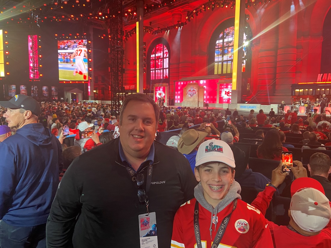
Brady Spencer with his son, John, outside Kansas City’s Union Station during the 2023 NFL draft.
A recent update in The Oklahoman newspaper on the new OG&E Coliseum under construction at the State Fairgrounds identified it as a venue designed by a firm named “Populous.”
In an even more recent story, I learned that Populous has been hired to design the new $71 million soccer stadium just south of OKC’s Bricktown.
I think I’m noticing a trend.
So, what exactly is Populous?
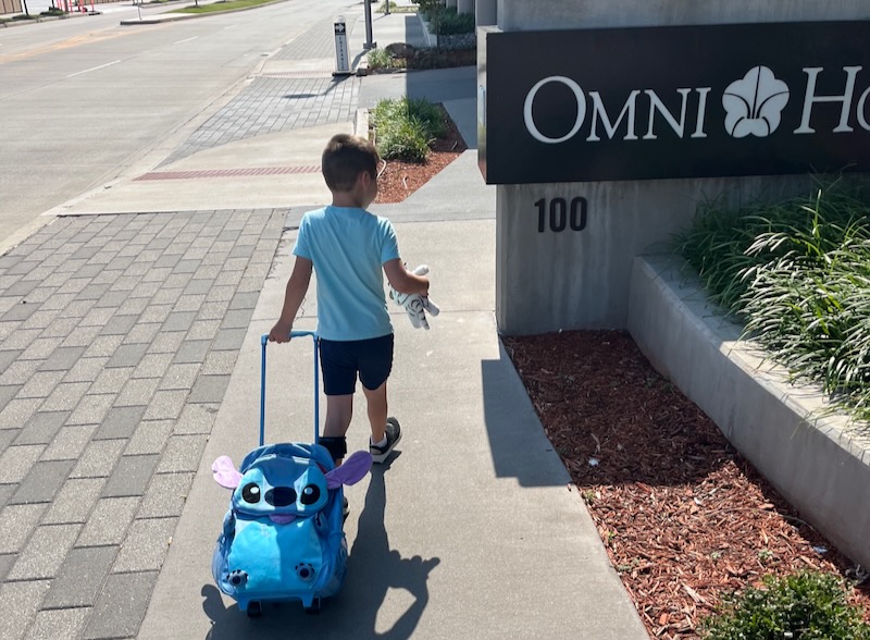
Solomon rolls his new backpack up to OKC’s Omni Hotel on Friday morning.
This is what happens when his GiGi is out of town on business and Papa is left in charge of entertainment on a Friday for our grandson, Solomon.
So, when it was just us two early Friday, Solomon said he wanted to go on a road trip. He suggested “the beach” and then Branson.
I said we couldn’t do either of those today, but maybe we could drive up to Guthrie and find a place to eat.
Solomon sort of accepted that, but later told me he wanted to go to that “nice Thunder hotel downtown.” All of us had stayed the night at OKC’s Omni Hotel last year when my wife, Paula, was booked there for a convention meeting.
A black ’65 Mustang that looks exactly as I remember the one driven by my Aunt Dee.
This is a story of the Ford Mustang. Or, rather, two Ford Mustangs. One of them did not have a happy ending, and I was in it.
If you are hazy on your Ford Mustang history, I’ll catch you up to date a bit. The Mustang was conceived by team at Ford led by Lee Iacocca, who later gained fame as the man who saved Chrysler.
The first Mustang was introduced to the public in April 1964, as the “1964-1/2” Mustang. It was an instant hit. The public fell in love with it because it had a unique, sporty body style compared to what U.S. autos had been, which were cars shaped like boxes and quite unattractive.
My dad was among the millions of Americans who were taken by the Mustang and eventually bought one when he was stationed on the island of Okinawa while in the military. I’ll come back to that.
I read a magazine article when I was in college in the 1970s about a scrappy startup called Apple Computer, founded by two guys named Steve who built their first computers in the garage at the home of one of the Steves.
I couldn’t get enough of their story; the David-vs.-Goliath way that Apple blazed the personal computer trail that forced the industry behemoth at the time, IBM, to play catchup. Steve Jobs and Steve Wozniak were my entrepreneurial heroes.
So, I admit that I am a long-time Apple fanboy and remain one today.
But my fandom has run smack into some ugly reality. Apple is no longer the scrappy industry underdog. In fact, it is one of the world’s largest companies by market value. Yet, it has begun to flex its financial muscles like a bully that nobody likes.
Here’s a bit of nostalgia for you. When I walked into the Southwest Times Record newsroom for the first time as an employee in 1978, I encountered a bustling community of talented writers, editors and photographers all scrambling to publish local news seven days a week.
The Fort Smith newspaper was a great place to learn the craft as my first job out of college. There are many folks among my former colleagues there whom I will never forget. I worked at the SWTR for five years in a variety of positions before moving to Oklahoma City and working for The Oklahoman for almost a quarter of a century.
So, it’s been disheartening to watch the SWTR decline as a community force over the past few years as the number of subscribers declined and employees were laid off. It’s a situation not unlike that in many other cities across the nation.
Evard Humphrey and his No. 12 super-modified sprint car
Editor’s Note: Don Mecoy is a friend and former colleague at The Oklahoman who retired as the newspaper’s managing editor at the end of 2022. A recent conversation about sports heroes from our youth when Don was a guest on the 3 Old Geezers podcast sparked his memory about a local race car driver fromthe late 1960s. Don wrote this guest blog post about that driver and those memories.
By Don Mecoy
I had my share of sports heroes when I was a kid. Roger Staubach, Lou Brock, Johnny Bench and Joe Washington were among my faves. But my personal hero — and it truly was personal — was a guy you probably never heard of: Evard “Kerfoot” Humphrey.
Evard was the driver of the No. 12 super-modified sprint car that ran every Friday night at State Fair Speedway during my youth in Oklahoma City.
Advertising banners cover the entire upper deck seating area down the first base line of the Bricktown Ballpark.
I was enjoying a summer evening at the Chickasaw Bricktown Ballpark with a friend last year, savoring the crowd, the game and the park’s immaculate green pasture.
Then my eyes landed on the upper deck along the first baseline that extends out into right field. There were no seats or bleachers visible. Only advertising banners draped across each section.
Don’t get me wrong. Oklahoma City has a beautiful ballpark that has retained its attractiveness since it opened in April 1998. However, the tarps do nothing but detract from the ballpark’s charm.
A ‘Golden At-Bat’ in future for New York Yankees star Aaron Judge?
When I was a young would-be sports writer just out of college working for the Southwest Times Record newspaper in Fort Smith, Ark., my editor sent me out to cover the state small school baseball tournament.
I had not seen much high school baseball through the years, so I was caught by surprise by one particular rule the small schools played by.
It was called the “Courtesy Runner.”
That rule allowed coaches to sub in a faster runner when a slower player got on base. But the player who was substituted for could remain in the game. Usually, the coach subbed in his fastest guy for the big, slow catcher.
I was offended by the Courtesy Runner, because I grew up following Major League Baseball and knew that once a player was substituted for, he was out of the game. No coming back in.
But the Courtesy Runner seemed popular with high school coaches in back in 1979, even if it messed up my boxscore at the end of the game. It remains in play for high schools, softball and even Little League Baseball.
And now the Courtesy Runner has been joined by other earthshaking changes infiltrating Major League Baseball itself as the game seeks a younger demographic. The pitch clock. Bigger bases. Fewer mount visits.
More is coming.
Recently, MLB Commissioner Rob Manfred discussed the possibility of baseball using what he called a “Golden At-Bat.”
“You put your best player out there out of order at a particular point in the game,” Manfred said. “That rule and things like that are only in the conversational stage right now.”
Major League Baseball Commissioner Rob Manfred said the ‘Golden At-Bat’ is being discussed
Here’s a scenario:
Let’s say the Yankees are down two runs in the 9th inning vs. the hated Red Sox with two men on base and two outs. The Golden At-Bat rule would allow them to bring Aaron Judge — their best hitter — to the plate even if his place in the batting order was six at-bats away.
I’m offended by the Golden At-Bat idea, just like I was offended by the Courtesy Runner all those years ago.
Call me a Geezer shouting GET OFF MY LAWN, but the Golden At-Bat concept seemed to come right out of left field, so to speak. It’s goofy. It’s unneeded. It’s a terrible idea.
Baseball already places a runner on second base to start the inning in extra innings. Now this?
Like me, much of the world of MLB fans reacted with horror to a rule that would skew baseball’s beloved statistics, which have withstood the test of time for more than 100 years.
There has been a chorus of boos across the nation from baseball fans, among them radio talk show host Dan Patrick. I listen to the podcast version of the DP Show daily, and heard Patrick’s reaction last week.
“I hate it,” he said. “Hate it. I hate the runner at second base to start extra innings. Don’t go too gimmicky. Does baseball need that? It felt like baseball had a good year, a great year.”
In the spirit of the Golden At-Bat, Dan asked his entourage of co-hosts, collectively known as the Danettes, to come up with some “even dumber” ideas for baseball. The guys were happy to oblige.
“Count the Golden At-Bat as two outs if the batter fails to get a hit.”
“if your team is up by 10 runs or more you have to pitch blindfolded.”
“If you throw a pitch 100 mph or more, it’s not a strike, it’s a ball.”
“One time a game, you can require the opposing team to remove one outfielder during an at-bat.”
The Danettes struck Dumb and Dumber gold with their ideas.
But, you know what? They didn’t mention the Courtesy Runner.
And I’m still offended by the Courtesy Runner after all these years.
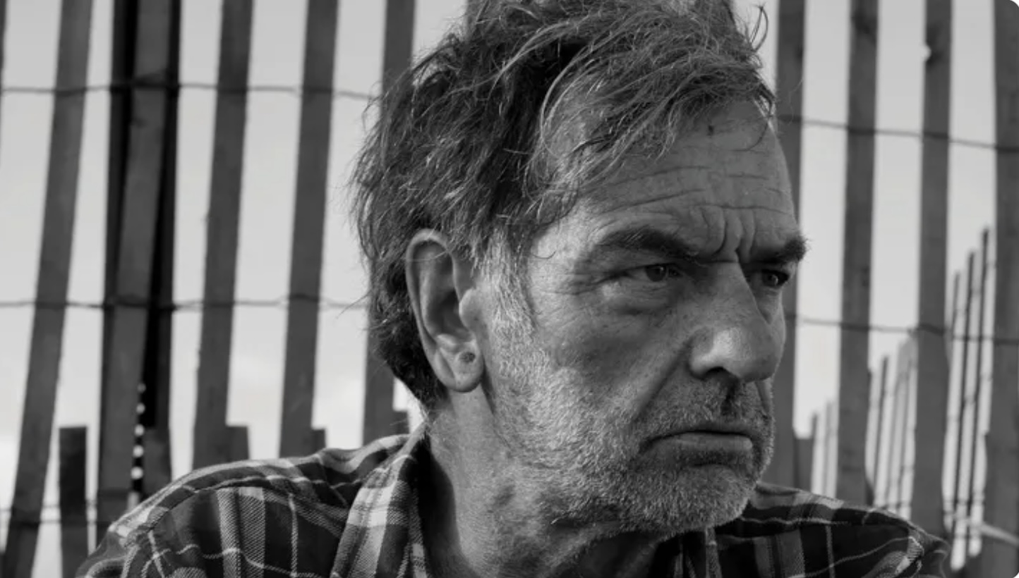
A portrait of Patrick Fealey, who wrote about his plight as a homeless person for Esquire magazine.
I’ve never been much of a social crusader like my friend and former high school classmate “Will,” about whom I wrote in a blog post last year.
Will was passing through town and asked if I would meet him for lunch, which I did. It was a great reunion after more than a half century of not seeing one another or even communicating.
Anyway, Will devoted much of his life to important work of helping lift the oppressed and bringing to justice the folks who actively sought to keep the “others” down.
Will, if you are reading this, I’m so awed and grateful for your efforts over the years.
Folks like Will make me realize that I’m more of an social activist wannabe who never really got up off the couch to help anyone, even those with whom I have great empathy.
That leads me to this disturbing Esquire magazine article my wife sent me last week. Entitled “The Invisible Man,” the article is a long, first-person account of a college educated, successful writer forced into living as a homeless person in his home state of Rhode Island.
Patrick Fealey found himself in this plight because of a mental illness that didn’t become apparent until he was a successful adult. Then his bipolar condition resulted in him being unable to hold a job, and the downward spiral began.
For me, the most disturbing aspect of Fealey’s life is that no one really cared. He lived with his dog in an old car, but where ever he landed, he was constantly questioned by police, shunned by local citizens. The folks who operated shelters or housing programs offered little help, hope or sympathy.
Fealey was told to ‘move on’ a lot, even though one of the communities in which he stayed with the town in which he was raised. He was told by one policeman that if he didn’t move on he would be jailed or fined. People saw him as threatening or merely another drug addict.
(As an aside, some folks read about Fealey plight and started a Go Fund Me page that has received more than $169,000-and-counting to help him get into housing and deal with health issues.)
All of this sounds familiar, especially after reading recent newspaper articles about how the city of Shawnee has implemented ordinances that prevent the unhoused from sleeping or camping in public spaces or most any place outdoors within the city limits.
So, while the Shawnee citizens just want the homeless out of sight and out of mind — like most of us — what they are doing is turning homelessness into a crime.
That’s why I’m proud of the city of OKC for investing $55 million through MAPS4 to take on homelessness with its “housing first’ program that partners with innovative not-for-profits. And MAPs also is funding a new mental health crisis center, a restoration center and a transitional housing program that will make a difference.
It’s a start.
There are also several not-for-profits in our community like the SideXSide OKC program and Curbside Chronicle that are working to lift people up. Those are terrific initiatives that are making a difference.
As for myself, I have done nothing to brag about except for occasionally buying a Curbside Chronicle.
I’m not sure what my point in writing all of this is, but after reading Patrick Fealey’s story I think the point is that we have to do better.
A few years ago my former colleague at The Oklahoman newspaper, Richard Mize, lamented the demise of the metal coffee can. The coffee industry eliminated the once ubiquitous coffee can and replaced it with plastic cans or closable pouches.
“Where will we put our bacon drippings?” Richard asked.
Good question, Richard. The coffee industry was totally unconcerned about the fallout in households across the nation where bacon grease was stored in empty coffee cans. How dare they.
Anyway, I see a similar crisis brewing in American households. Newsprint is rapidly disappearing from our driveways and kitchen tables.
Instead of picking up our actual paper from the driveway each morning, Americans are more likely to read an online version — or, more disappointing, not read any newspaper at all.
Earlier this year I wrote about the decline of my first newspaper employer, the Southwest Times Record in Fort Smith, Ark.
In fact, I’ve seen firsthand the impact the shortage of old newsprint has had on my neighbors in recent years.
Since I am virtually the only print subscriber of The Oklahoman on my street, a neighbor twice asked me for my old newspapers to use for packing before she moved and again when her daughter moved into her own apartment. I gladly shared my bounty of old newsprint.
So this leads me to the point of this post: how we’re going to miss the many ways old newspapers are used around the house — or used to be. Here are a few:
As liner for a birdcage (now that’s low-hanging fruit, I know).
As fish wrap (a common newsprint stereotype).
Lining the floor next to an outside door when potty training your puppy. It worked on my now departed Boston Terrier decades ago.
Packing in preparation to make a move (see example above)
Creating pirate hats. As children, my sister and I learned to fold the newspaper into the most awesome pirate hats we could imagine. We proudly wore them around our house or paraded through the neighborhood.
Making kites. My dad made a newsprint kite for me when I was about 10 years old, and it actually flew as well as the store-bought kind.
As floor liner when doing a paint job or an art project.
Newsprint is great as backing on a counter when you are cutting a watermelon, then wrapping the rinds before throwing them out.
Packed away in your closet or attic to hold on to keepsake articles for the memories.
Current event articles clipped for school projects.
Finally, a rolled up newspaper makes a fine rod of discipline for a wayward pet. I only had to roll the paper up and raise it above my head to stop my Boston Terrier from committing an offense such as chewing up a shoe.
We’re going to miss newsprint for many reasons beyond just reading the paper when its gone.
BONUS: If you’ve got other ways you’ve recommissioned old newspapers in the past, leave them in comments below.
This just in from my friend Josh O’Brien on an alternative use for old newspapers: “Another use: cleaning big mirrors or windows — much better than paper towels.”
Richard Mize (see above) added: “One more thing: I use three sheets of newsprint to light my charcoal chimney for grilling!”
From David Yarbrough in Fort Smith, Ark: “Use as fly (or wasp) swatter, although not as ergonomically designed as plastic ones.”
One more from Linda Lynn: “Gift wrapping. And to protect table from kids’ art projects … and for art projects like collages and paper mache. We even used to create Christmas trees with newspaper.”
From Steve Barrymore: “I save mine all year then use as a weed barrier in the garden at planting time. I then cover it with mulch. Eliminates weeding.”
From Kathy Consbruck in Nebraska: “Mine go to the pet shelter. They line the kennels with them.”
From Phyllis Welsh Bennett: “A long time ago, I used strips of colored Sunday comics to make a chain to adorn a Christmas tree at The Oklahoman. Last week I gave a stack of old papers to someone needing it to pack glassware for a move. Each weekday I put my newspaper in the waiting area of the Teachers’ Retirement System. I’m told a lot of TRS members enjoy reading a paper newspaper!”
From LaRita Dawn Watson: “I save mine for my Dad to read since he lives outside the delivery area and won’t read the online version. I have used to clean windows and mirrors, and it works better than any cloth! I’ve used it in all the ways mentioned and will truly miss it when it’s gone. It feels good to turn the pages and read.”
OKC Thunder City edition uniforms through the years.
Together with my friends Steve Buck and Ed Godfrey, I cohost a podcast known as the 3 Old Geezers.
Steve and Ed are only pretend Geezers, while I am the real deal. Or as Ed says, I live in downtown Geezerville. That’s ageism, Ed!
Anyway, all of us are OKC Thunder fans, and much of our podcast discussion revolves around the team, the players and the potential for success as the season progresses.
We also share an interest in Thunder branding and the various uniform schemes the team uses. For instance, I’m a big fan of the team’s “Sunset” uniform, which might be seen as orange by some folks.
All of which brings me to the annual “City” edition uniform the Thunder unveils as each season begins. The 3 Old Geezers recently critiqued the 2024 City edition. on the podcast (LISTEN!)
Someone suggested that we rank the City edition uniforms from 2017-2024 by our personal preferences. So here are mine, ranked No. 8 to No. 1:
No. 8 2020: I take issue with leaving the word “City” off of a uniform of the team known as the Oklahoma City Thunder. Makes no sense unless you think the folks in Tulsa or Elk City will buy into the team even more than they already do when they see “Oklahoma.”
No. 72021: Not sure what statement a gray-on-white City edition uniform makes, except that it doesn’t stand out to me.
No. 6 2022: I have nothing against this uniform, except the lettering looks too much like what we’ve already seen, And it uses “Thunder” instead of OKC or Oklahoma City.
No. 5 2019: White lettering on a gray uniform doesn’t do much for me. At least it says “Oklahoma City.”
No. 4 2017: I’m just not a fan of racing stripes on a gray background. But it gets extra credit because it says “OKC.”
No. 3 2024: I really like the color scheme but can’t rank this one higher because leaves off the word “City” AGAIN.
No. 2 2018: The lettering and the turquoise make this one of my favorite City edition unis. And I like that it reads “OKC.”
No. 1 2023: I love this City edition version. It’s got orange and yellow trim on the navy jersey with bold orange “OKC”. That’s good enough for me.
Here are the takes from my fellow Geezers:
Steve Buck
Geezer Jim asked Geezer Ed and me to rank our team’s city jersey series. I am not a graphic artist so I’m sure my limited mind has missed some really cool elements that others love, but my rankings fell out pretty darn clearly.
No. 8 2020: Just not much to like on this one. Looks like the packaging to a Hot Wheels car. Points deduction for reading “Oklahoma”
No. 7 2017: I almost moved it higher because the year matched Poku’s number but common sense prevailed. I can’t find any connection to Oklahoma City and it just doesn’t look very sharp.
No. 6 2021: Not awful but not that attention grabbing either. The vertical look makes it somewhat unique but I prefer a bit of color in my uniforms and this is just too blah.
No. 5 2019: Almost crept into my top half of rankings. Like ’21 there is jut not a pop in terms of color but the arched Oklahoma City is just fine with me.
No. 4 2024: First too similar to ’23 so I had to provide some penalty for copying the prior year’s efforts. I like the colors and the detail on the sides are a nice nod to OKC. Speaking of…why didn’t it say Oklahoma City instead of simply using Oklahoma. Like the ’20 version, points deducted.
No. 3 2022: This one could’ve easily been my #2 choice. The blue and red pops against the dark gray. Just a super crisp look that was a wonderful look on the floor.
No. 2 2023: I loved every element of this jersey. The dark blue with all the intricate details was so solid. The accent colors stand out beautifully. The diagonal in motion OKC is really on nice.
No. 1 2018: Yes, the color scheme has nothing to do with our current colors other than a few subtle uses in the accents but the design is fantastic and this jersey screams OKC like none other. It was unique in the league and a true reflection of honor and respect for our community and state. Bring these back. For my votes, this was the hands down winner.
Ed Godfrey No. 8 is the first city edition jersey to not include “City” in the name, the 2020-21 version. Again, they are the Oklahoma City Thunder, not the Oklahoma Thunder. I think the jersey is ugly.
No. 7 is the first city edition jersey, the 2017-18 gray uniform. An orange and blue stripe with the OKC logo above it. Meh.
No. 6 is the simple all white city edition of 2021-22. I’m not a big fan of the all-white look with the OKC logo displayed vertically on the jersey, but it’s OK.
No. 5 2024-25 is the latest city edition jersey. I love the look and the colors that pop. This jersey would rate higher if it had the word “City” on it and not just “Oklahoma.” A city edition jersey without the word city?
No. 4 is the 2023-24 version. I like the vibrant colors of yellow and orange and the design is interesting and artistic.
No. 3 is the 2022-23 City edition jersey. A simple, but solid look with “Thunder” emblazoned across the chest. The “Oklahoma Standard” badge is displayed on the jersey.
No. 2 is the 2019-20 slate gray City edition tribute to the 25th anniversary of the bombing of the Alfred P. Murrah Federal Building. The gray uniforms with gold lettering and white accents are fantastic.
No. 1: My favorite City edition jersey is the 2018-19 turquoise version that paid tribute to Oklahoma’s Native American heritage. I love the color and the diamond influence in the OKC logo. It’s a sharp look.
So, what’s your favorite and least favorite among the Thunder’s City edition uniforms? Leave your thoughts on the City editions in the comments.

 That was the theme when 10,000 or so Hog-callers began their final caravan across the Red River and out of the Lone State after the Southwest Conference basketball tournament last March. The Razorbacks had bid adieu to their SWC step-brothers with an astounding thrashing of the Texas Longhorns for the tournament championship, and along with the Razorback women’s team, hauled away every basketball prize the league had to offer.


 The author wearing his new Airpods Pro 2 hearing aids


 No. 8 2020: I take issue with leaving the word “City” off of a uniform of the team known as the Oklahoma City Thunder. Makes no sense unless you think the folks in Tulsa or Elk City will buy into the team even more than they already do when they see “Oklahoma.”
 No. 7 2021: Not sure what statement a gray-on-white City edition uniform makes, except that it doesn’t stand out to me.
 No. 6 2022: I have nothing against this uniform, except the lettering looks too much like what we’ve already seen, And it uses “Thunder” instead of OKC or Oklahoma City.
 No. 5 2019: White lettering on a gray uniform doesn’t do much for me. At least it says “Oklahoma City.”
 No. 4 2017: I’m just not a fan of racing stripes on a gray background. But it gets extra credit because it says “OKC.”
 No. 3 2024: I really like the color scheme but can’t rank this one higher because leaves off the word “City” AGAIN.
 No. 2 2018: The lettering and the turquoise make this one of my favorite City edition unis. And I like that it reads “OKC.”
 No. 1 2023: I love this City edition version. It’s got orange and yellow trim on the navy jersey with bold orange “OKC”. That’s good enough for me.