
Together with my friends Steve Buck and Ed Godfrey, I cohost a podcast known as the 3 Old Geezers.
Steve and Ed are only pretend Geezers, while I am the real deal. Or as Ed says, I live in downtown Geezerville. That’s ageism, Ed!
Anyway, all of us are OKC Thunder fans, and much of our podcast discussion revolves around the team, the players and the potential for success as the season progresses.
We also share an interest in Thunder branding and the various uniform schemes the team uses. For instance, I’m a big fan of the team’s “Sunset” uniform, which might be seen as orange by some folks.
All of which brings me to the annual “City” edition uniform the Thunder unveils as each season begins. The 3 Old Geezers recently critiqued the 2024 City edition. on the podcast (LISTEN!)
Someone suggested that we rank the City edition uniforms from 2017-2024 by our personal preferences. So here are mine, ranked No. 8 to No. 1:
 No. 8 2020: I take issue with leaving the word “City” off of a uniform of the team known as the Oklahoma City Thunder. Makes no sense unless you think the folks in Tulsa or Elk City will buy into the team even more than they already do when they see “Oklahoma.”
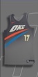
 No. 7 2021: Not sure what statement a gray-on-white City edition uniform makes, except that it doesn’t stand out to me.
 No. 6 2022: I have nothing against this uniform, except the lettering looks too much like what we’ve already seen, And it uses “Thunder” instead of OKC or Oklahoma City.
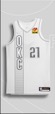
 No. 5 2019: White lettering on a gray uniform doesn’t do much for me. At least it says “Oklahoma City.”
 No. 4 2017: I’m just not a fan of racing stripes on a gray background. But it gets extra credit because it says “OKC.”
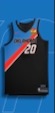
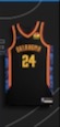 No. 3 2024: I really like the color scheme but can’t rank this one higher because leaves off the word “City” AGAIN.
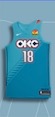 No. 2 2018: The lettering and the turquoise make this one of my favorite City edition unis. And I like that it reads “OKC.”
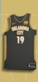
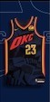 No. 1 2023: I love this City edition version. It’s got orange and yellow trim on the navy jersey with bold orange “OKC”. That’s good enough for me.
Here are the takes from my fellow Geezers:
Steve Buck
Geezer Jim asked Geezer Ed and me to rank our team’s city jersey series. I am not a graphic artist so I’m sure my limited mind has missed some really cool elements that others love, but my rankings fell out pretty darn clearly.
No. 8 2020: Just not much to like on this one. Looks like the packaging to a Hot Wheels car. Points deduction for reading “Oklahoma”
No. 7 2017: I almost moved it higher because the year matched Poku’s number but common sense prevailed. I can’t find any connection to Oklahoma City and it just doesn’t look very sharp.
No. 6 2021: Not awful but not that attention grabbing either. The vertical look makes it somewhat unique but I prefer a bit of color in my uniforms and this is just too blah.
No. 5 2019: Almost crept into my top half of rankings. Like ’21 there is jut not a pop in terms of color but the arched Oklahoma City is just fine with me.
No. 4 2024: First too similar to ’23 so I had to provide some penalty for copying the prior year’s efforts. I like the colors and the detail on the sides are a nice nod to OKC. Speaking of…why didn’t it say Oklahoma City instead of simply using Oklahoma. Like the ’20 version, points deducted.
No. 3 2022: This one could’ve easily been my #2 choice. The blue and red pops against the dark gray. Just a super crisp look that was a wonderful look on the floor.
No. 2 2023: I loved every element of this jersey. The dark blue with all the intricate details was so solid. The accent colors stand out beautifully. The diagonal in motion OKC is really on nice.
No. 1 2018: Yes, the color scheme has nothing to do with our current colors other than a few subtle uses in the accents but the design is fantastic and this jersey screams OKC like none other. It was unique in the league and a true reflection of honor and respect for our community and state. Bring these back. For my votes, this was the hands down winner.
Ed Godfrey
No. 8 is the first city edition jersey to not include “City” in the name, the 2020-21 version. Again, they are the Oklahoma City Thunder, not the Oklahoma Thunder. I think the jersey is ugly.
No. 7 is the first city edition jersey, the 2017-18 gray uniform. An orange and blue stripe with the OKC logo above it. Meh.
No. 6 is the simple all white city edition of 2021-22. I’m not a big fan of the all-white look with the OKC logo displayed vertically on the jersey, but it’s OK.
No. 5 2024-25 is the latest city edition jersey. I love the look and the colors that pop. This jersey would rate higher if it had the word “City” on it and not just “Oklahoma.” A city edition jersey without the word city?
No. 4 is the 2023-24 version. I like the vibrant colors of yellow and orange and the design is interesting and artistic.
No. 3 is the 2022-23 City edition jersey. A simple, but solid look with “Thunder” emblazoned across the chest. The “Oklahoma Standard” badge is displayed on the jersey.
No. 2 is the 2019-20 slate gray City edition tribute to the 25th anniversary of the bombing of the Alfred P. Murrah Federal Building. The gray uniforms with gold lettering and white accents are fantastic.
No. 1: My favorite City edition jersey is the 2018-19 turquoise version that paid tribute to Oklahoma’s Native American heritage. I love the color and the diamond influence in the OKC logo. It’s a sharp look.
So, what’s your favorite and least favorite among the Thunder’s City edition uniforms? Leave your thoughts on the City editions in the comments.
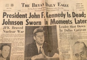 Nov. 22, 1963 — JFK assassination. This was an incredibly traumatic event both for the nation and a 10-year-old me. I was sitting in a 5th grade classroom at Crockett Elementary in Bryan, Texas, when we all heard the news. My teacher, Ms. Skrivanek, cried. I thought of nothing but that event for weeks.
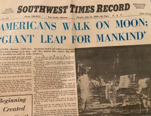 July 20, 1969 — The moon landing. This was huge. We got to stay home from Sunday night church to watch the first man step on the moon. My dad was in Vietnam, and I watched it with my mom and my sister in our living room in Fort Smith, Ark. I’m pretty sure we still had a black and white television.
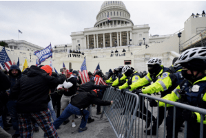 Jan. 6, 2021 — A day that will live in infamy. Like most of America, I was watching the debate over the Electoral College certification when the mob broke into the Capitol. Insurrectionists, white supremacists, traitors, all the same to me. They are egged on by a would-be dictator not grounded in reality.
